Solar Fintech Calculator | Design Challenge
UI/UX
Product Design
Fintech Energy
As part of a design challenge for a venture-backed fintech initiative, I was tasked with creating native iOS app screens for a solar system calculator and quote summary. The goal was to help customers understand the financial impact of installing a solar system — from upfront costs to long-term savings — and guide them confidently through their decision-making process.
Client
Design Challenge
Tool
Figma,Apple Human Interface Guidelines
Year
~4 days
Role
Product Designer

Fintech
©2025


Ideation & Solutions
🔸 Sunspot
Too many steps, no progress indicator → user anxiety
Quote transparency lacking → delayed payoff info
🔸 SolarQuotes
Form-heavy, lead-gen focus → no real guidance
Assumes users know their system size
🔸 SolarCalculator.com.au
Dense charts, no storytelling
No fallback if users don’t know their usage
How calculator works

Calculator breakdown
Iteration
Low-Fidelity Mobile Prototype
WIREFRAMES
Simplified the summary screen to prioritise outcomes over raw data
Reordered inputs to show savings earlier
Created a design system of UI cards and components for future scalability (tablet, web)

Low FI wireframe
Iteration Highlights
WIREFRAMES


Key Flow Decisions
Journey Split
Users first select if they’re first-time installers or upgraders. This small split allows the experience to feel personalised early on.
📍 Postcode input follows—used to infer sunlight intensity, average system sizes, and region-specific defaults for smarter recommendations.


Key Flow Decisions
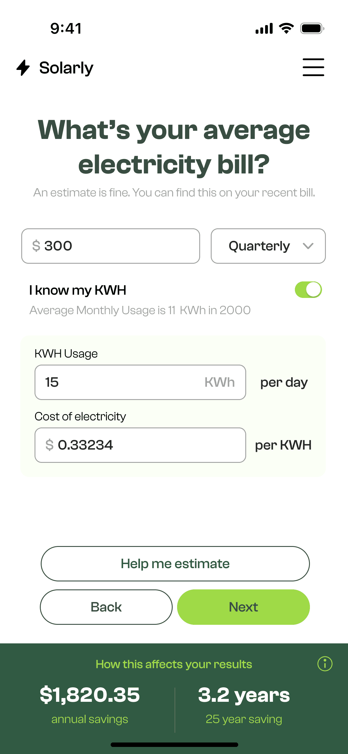
Electricity Bill Input
Claire might not know her kilowatt usage, so I offered an alternative estimation path based on household size and time-of-use habits.
To keep motivation high, a sticky footer shows early estimates: “You could save ~$1,240/year, payback in 4.2 years.”
Key Flow Decisions
Roof & Location
Users enter their roof material and see a visual map of their home. This builds relevance and trust, replacing cold forms with contextual imagery.


Key Flow Decisions
Summary Screen (Core UI)
Toggle between loan vs upfront
Graph shows cumulative savings vs cost over 25 years
Key insights like first-year savings, payback time, and monthly repayment are visually prioritised
Users can download, email, or apply directly—offering both soft and hard CTAs depending on readiness

